The Last Battle: A Visual Analysis
A visual analysis for my English Comp class.
The Last Battle
The Last Battle
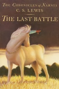
My initial reaction to the book cover for C.S. Lewis’ The Chronicles of Narnia: The Last Battle is that it is stoic and intense. The unicorn pictured looks out over its shoulder seemingly with a look of longing or regret. Dark clouds fill the sky and blood drips from the unicorn’s horn alluring to a dark mood for the book. The scene seems to be on the cusp of a big change coming.
The image takes place in the land of Narnia, one separate from our own. Created by British author C.S. Lewis, Narnia is a land where magic exists, and creatures the likes of which do not appear in our own world except in tales. In Narnia there are talking beasts, moving trees, unicorns, giants, witches and so much more. The Chronicles of Narnia series, 7 books in all, covers many adventures that take place in the land of Narnia and the surrounding countries. Throughout the series the land of Narnia might go through some trials and wars, but always ends with the King or Kings and Queens restoring Narnia to its place of glory and peace.
The cover to the last book in the Chronicles of Narnia series centers on Jewel the Unicorn who is surprisingly a secondary character in this title. Jewel is wearing a chain of gold that could signify his close association with the present King of Narnia. He is standing on a hill looking over his shoulder at what is presumably a battle or perhaps the land of Narnia as a whole. The cover has very little action going on in it. The unicorn is standing still with no other characters on scene. The wind seems to be still or blowing only slightly. The entire piece has an eerie stillness to it. When you combine the stillness with the overwhelming dark sky it seems that the piece is conveying that a change is coming. A dark presence has settled over Narnia and from the title and the fresh undried blood on the horn you can presume that a battle will ensue in the story.
The artist has positioned Jewel’s head so that it is at the center of the piece, with the bloodied horn drawing your attention. Your eye gets drawn right to the horn when you first look at the piece. The overall piece uses muted colors to pull you towards the bright red blood as well.
Even Jewel’s legs create a triangle (known to artists as the Golden Triangle) with the top point being Jewel’s face and horn. The contrast between Jewel’s light face and the dark sky also makes it ‘pop’ and makes it more noticeable to the viewer.
The book series being primarily marketed towards children during a more conservative time obviously means that the presence of blood would be small and only allude to violence. Lewis also wanted the series to be for adults too. The image entices enough mystery and fascination for young children as well as adults. Since the book is for adults and children it stands to reason that the title on the cover is not overly complicated. The font uses serifs but is still simple. It is not overly fancy which helps it maintain its readability.
Jewel, a character known for his friendliness and peace loving nature, maintains a stoic and regal like demeanor in this image. He was known to be fierce with his horn if he did engage in battle. With his calm presence and the blood on his horn signifying a battle, Jewel creates juxtaposition in and of himself of two natures; peace and chaos.
The image, seemingly done in colored pencil, signifies an important shift in the land of Narnia. Jewel, standing regal atop a hill is looking back at the land that the reader has come to love through the other books. The darkness in the background and the lightness of the grass at the unicorn’s feet signifies he is moving forward and leaving what they once knew behind. He looks to have a calm nature which leads me to believe that the danger they went through is over, only the blood on his horn remaining.
As a whole the piece is communicating a sense of leaving what you once knew. That change has come and it’s time to move on leaving the world of Narnia behind. This cover seems to be whispering “Things are about to change in Narnia and nothing is going to be like you remembered it.” The cover leads well into the beginning of this book which is written in a way that almost seems to create a sense of un-belonging. It’s still Narnia, but something has changed. We can dissect every detail of this image, but it won’t change the fact that this cover emboldens the ideas of a harrowing and intense battle that will lead to a complete turn-around for the life of Narnians.
-XO Juls


Comments
Post a Comment